
To kick off my Olympic musings, I want to talk about art. Or, more specifically color. I did a project for my Text, Art, and Performance class about Olympic logos and pictograms, and in doing that research I realized something. I do not like the London 2012 logo.


Logos traditionally have an image above the city name and the year above the Olympic rings. London, obviously, changed all of that. The reasoning is apparently that it's more formatted for different mediums -- the old logos have a lot of stuff going on and may not be as appropriate for the Internet generation. And, okay, I can understand that. The London logo is probably much better than the Beijing logo to view on a smartphone. So for this purpose, I think it's a winner. I just hate the colors.
Isn't this version much better? I normally love hot pink, but I'm sorry, it's just not a color that anyone associates with the Olympics, and I don't think London is going to change that. In my mind, the logos and colors of each Olympics are supposed to reflect the host city and/or country. The colors of the Vancouver logo were chosen because of their significance to Canada, and the image comes from the native culture. Beijing's is red (the color always associated with China) and looks like a Chinese character. Torino's is blue (evoking both the color of snowy mountains and the Italian football jersey) with a very Italian-looking font. The Athens logo is an olive wreath, which is completely self explanatory. But London's logo? Does this evoke London at all?
I do love the font. That feels like London. But hot pink? I lived in London for five months and don't recall ever seeing anything that made me believe this is a good color to represent the city. And the yellow makes it look like it was colored in by a highlighter. It's kind of a shame.
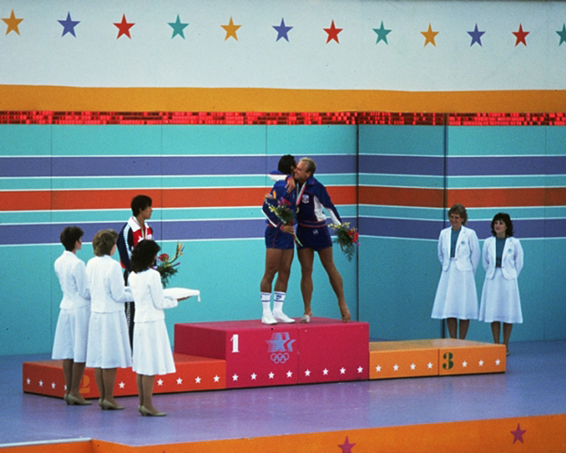
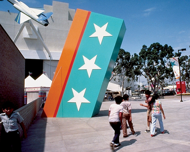
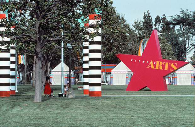
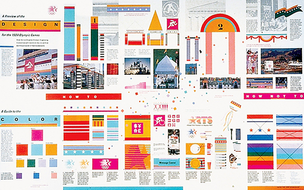
But let's take a walk down memory lane, shall we? Take a gander at the color scheme of the 1984 Olympics in LA.

And, now, the London 2012 color scheme;
They. Are. The. Same.
In the '80s (and the '60s, with the Mexico City color scheme in '68), this was for a reason. The world was in the middle of the Cold War, and these bright, fun, kind of tacky colors told the world to relax and have a good time. Is London trying to say the same thing? Honestly, there's a good chance. But this carefree image is much more associated with Mexico and LA. London is more known for its history and, well, British-ness than for its chill, party atmosphere... probably because it doesn't really have a chill, party atmosphere. Is this London trying to separate itself from Beijing? It's probably a bit of that too.
I still think it looks like highlighter.
No comments :
Post a Comment